Kumi Health
Brand and digital design for a healthcare start-up.


Hamburg-based start-up, Kumi Health, has the goal of significantly simplifying the work of clinical teams via a digital product which standardizes treatment excellence. As the Lead Brand and Digital Designer, I have been assisting Kumi accomplish this vision since March 2021.
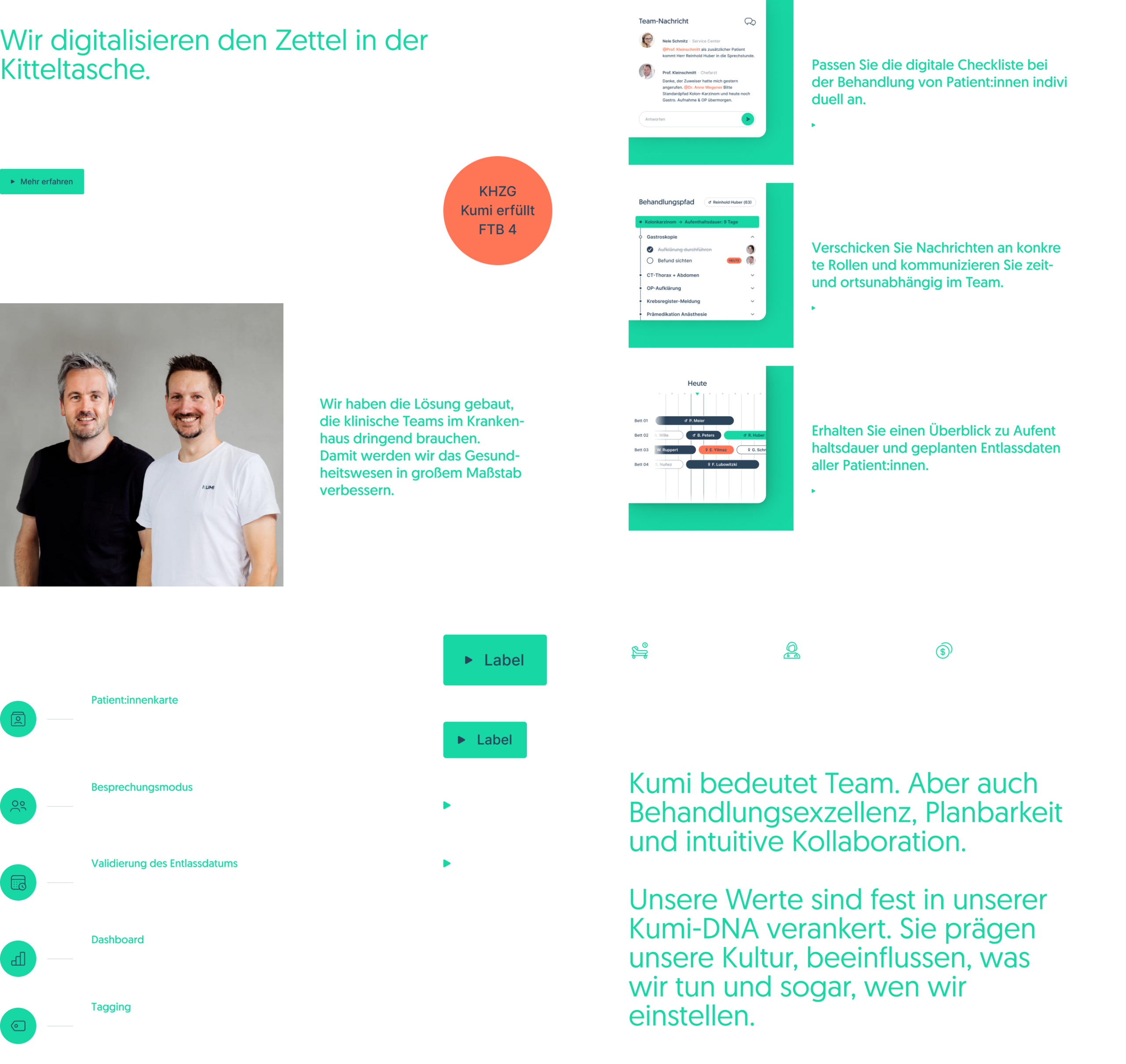
In the initial process, I designed the visual foundation and created the brand design; consisting of the logo, color scheme, and typography. Following this, the digital brand presence was optimized for all relevant channels and the website was fundamentally redesigned.
Since the beginning, I established basic structures for an efficient design system – transparent, flexible and geared towards dynamic growth. It allows Kumi every opportunity to achieve its ambitious goals.


The brand colors are used flexibly within the web pages and can change, depending on the type of content or narrative form. This individually highlights the respective sections. All building blocks of the website can be variably placed on the three backgrounds: Mint, Slate, or White – which offers countless possibilities when building the pages.

The design language is most harmonious on a blue background with the interplay of all brand colors. Through a playful approach to the abstracted Kumi Design Pattern, the brand is additionally enhanced and the design element is deliberately woven into the building blocks.

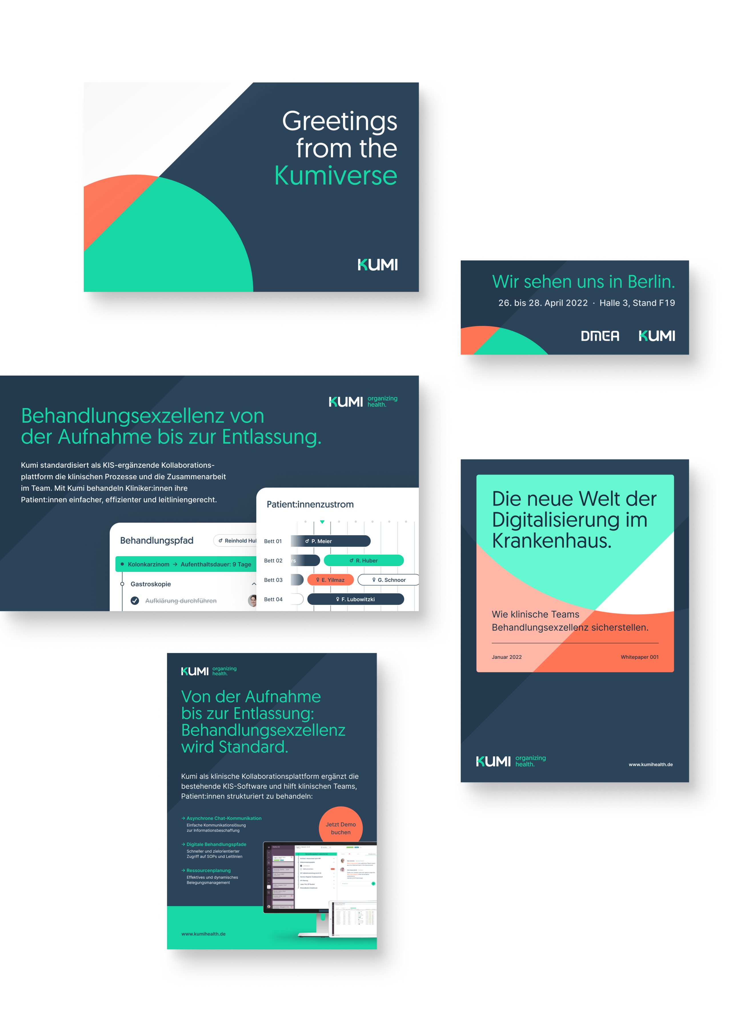
In addition to the new website, other design elements were created that convey Kumi's specific brand look with their communication goals. Thus, a holistic branding has emerged from the digital, which has been adapted then further developed for all relevant channels.

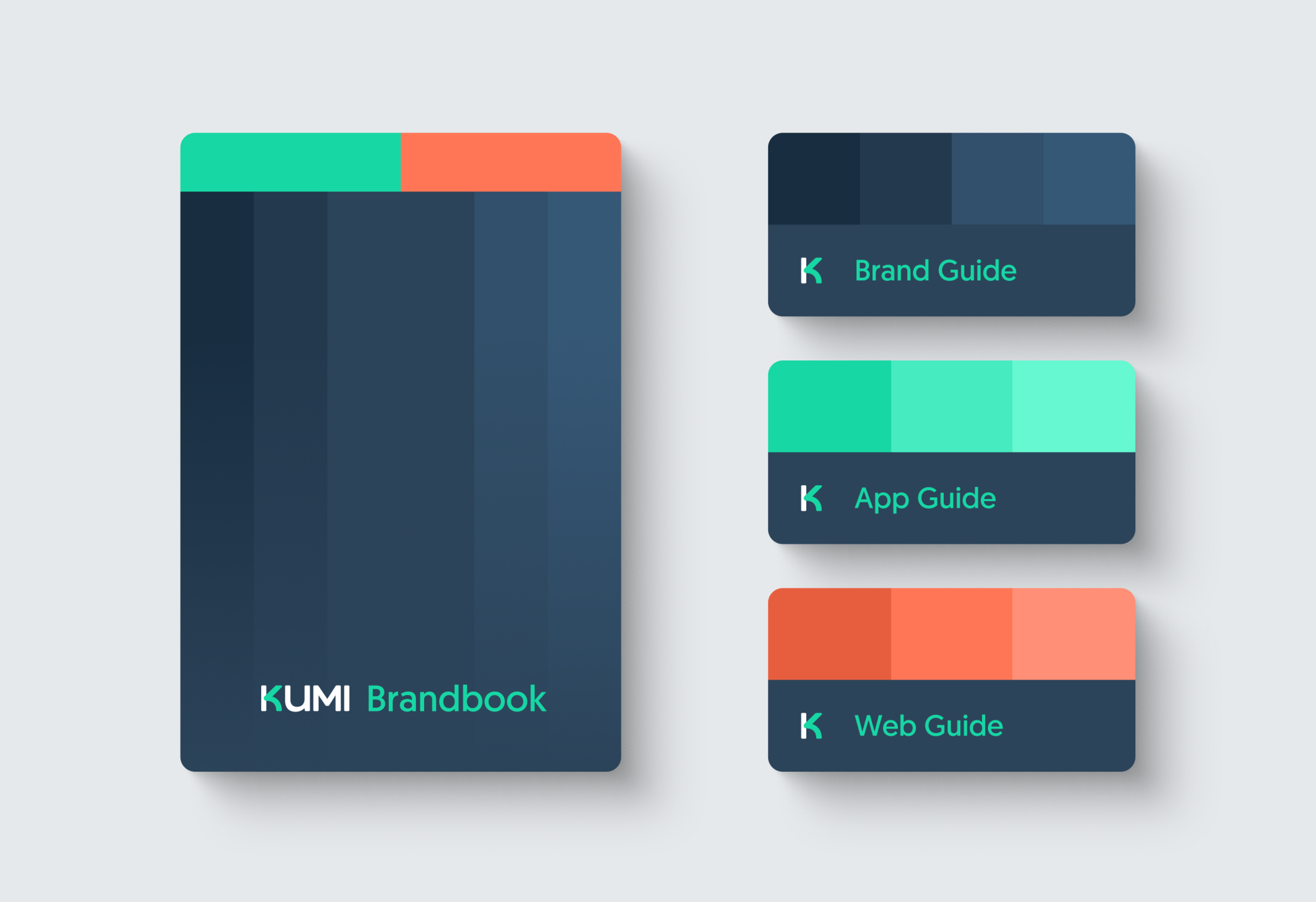
Behind all these designs, is a sustainable design system which ensures that the brand develops and grows consistently and efficiently long-term. The brand, web, and app areas are significantly different, yet all culminate on the same foundation.
For collaborative working and efficient onboarding, attention to detail was made since the beginning. This was with transparent documentation of the underlying structures in Figma, as well as the design language and all associated elements.


- Client
- Kumi health
- Creative Direction
- Finn Fischer
- Brand & Digital Design
- Finn Fischer
- Web development
- Tim Narr
- Illustration
- Keenly