Der Spiegel
The overdue redesign of the worlds first digital newspaper.
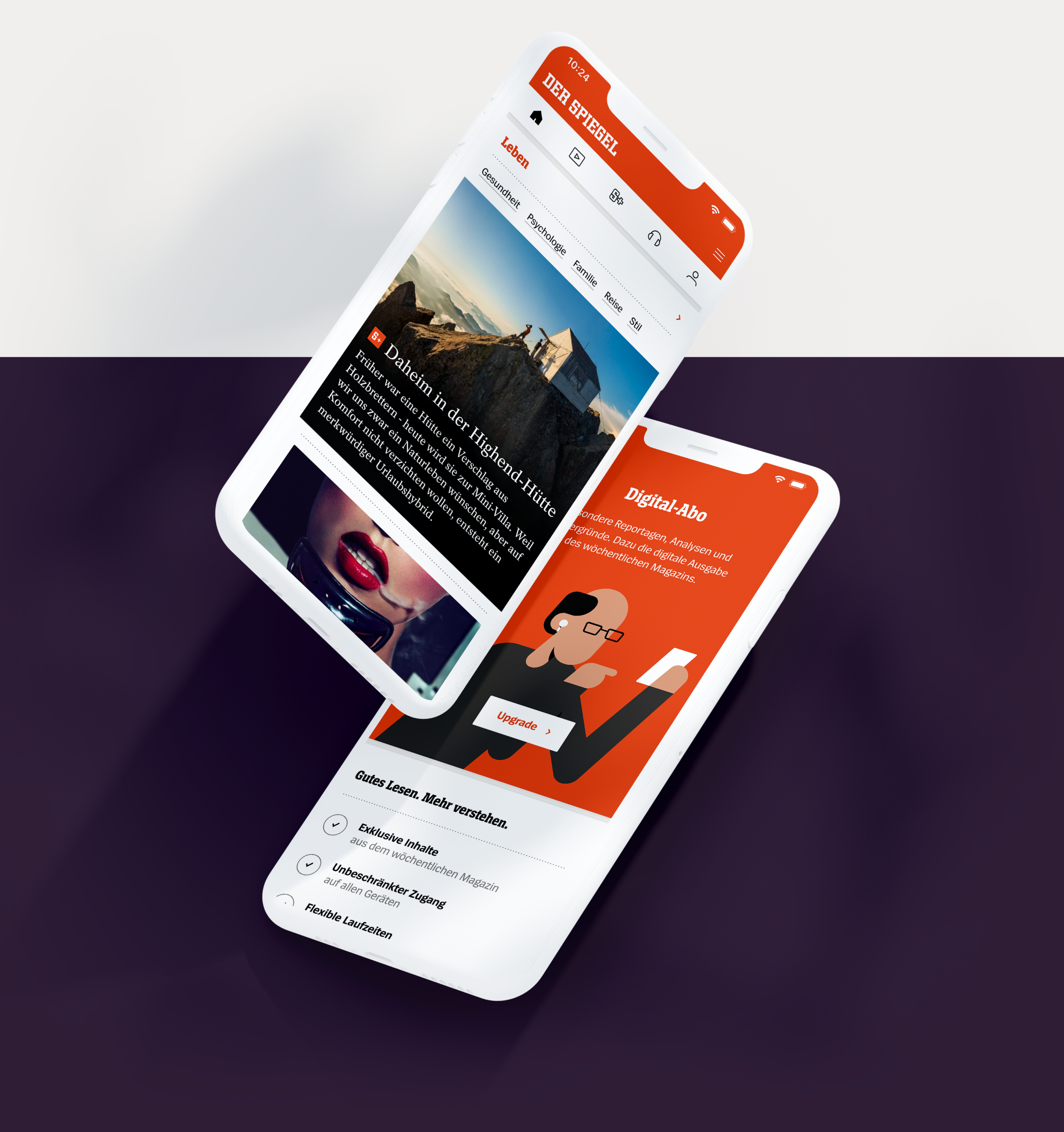
In 1994 – Der Spiegel was the world's first news platform on the Internet. Today, it receives more than 22 million visitors a month and the demands on digital reporting are higher than ever. Together with Make Studio I had the honor to take it to a whole new level.
As part of an interdisciplinary team of three designers, I redesigned the digital SPIEGEL from the ground up – by visually merging and reinterpreting what is arguably Germany's best-known news site with its renowned print magazine.
Furthermore, a robust and versatile design system was developed, which not only reproduces the components of the well-known news site, but is also used for other Spiegel products on all platforms.
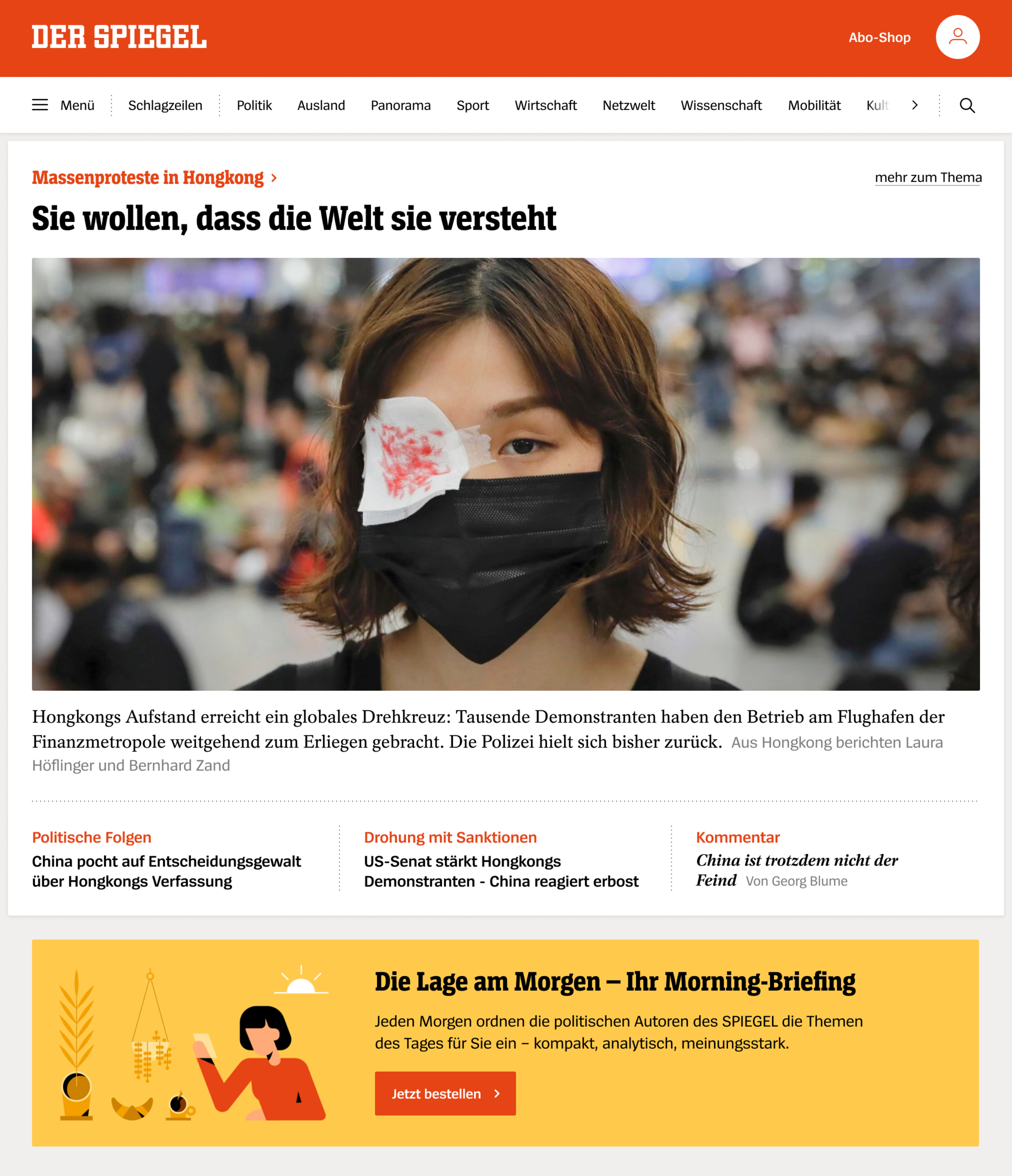
Typographically and in terms of color, the design has been brought closer to that of the magazine. In the design, this is expressed by striking typography in the right places, a conscious use of the new signal red, and a clear structuring of the content. The digital brand experience was fundamentally renewed.
Whether it's a single news item or a complex block of topics – the new design language was broken down into robust individual modules, then structured and made accessible in a flexible system.
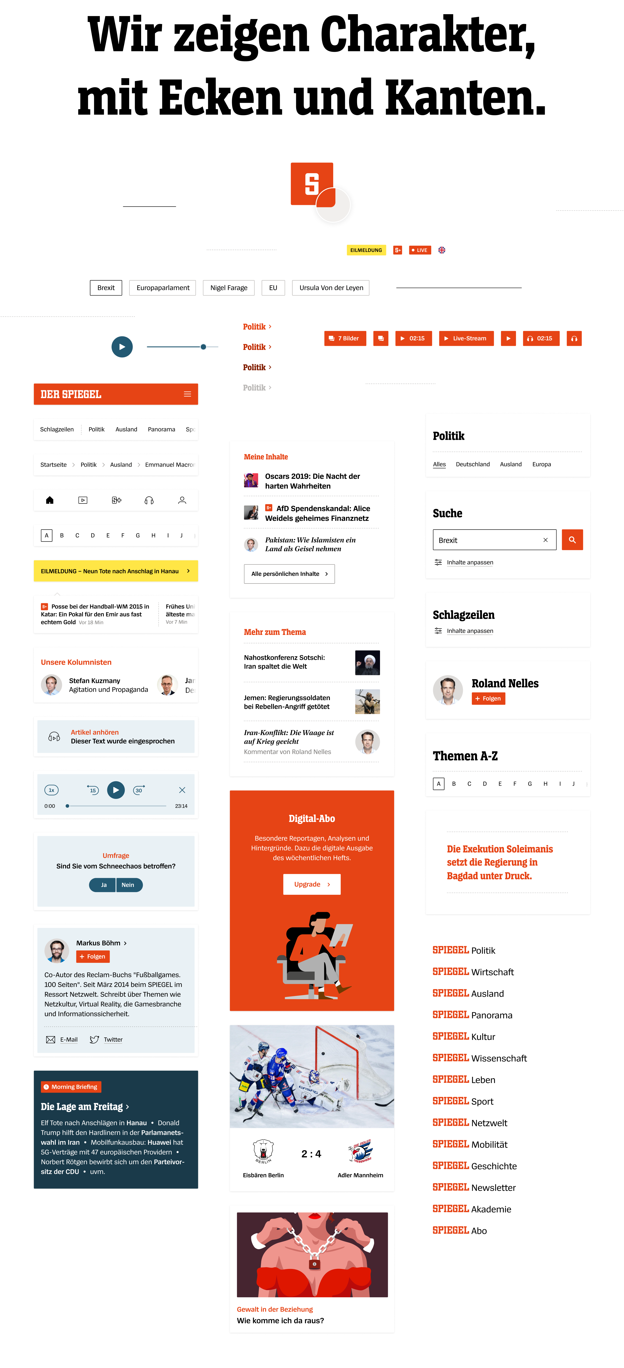

One focus within the project was on the audio player. This is mainly used in the app and plays podcast content, music, or reads out entire articles. With an independent color scheme and typical style elements, various player representations for different use cases were created.
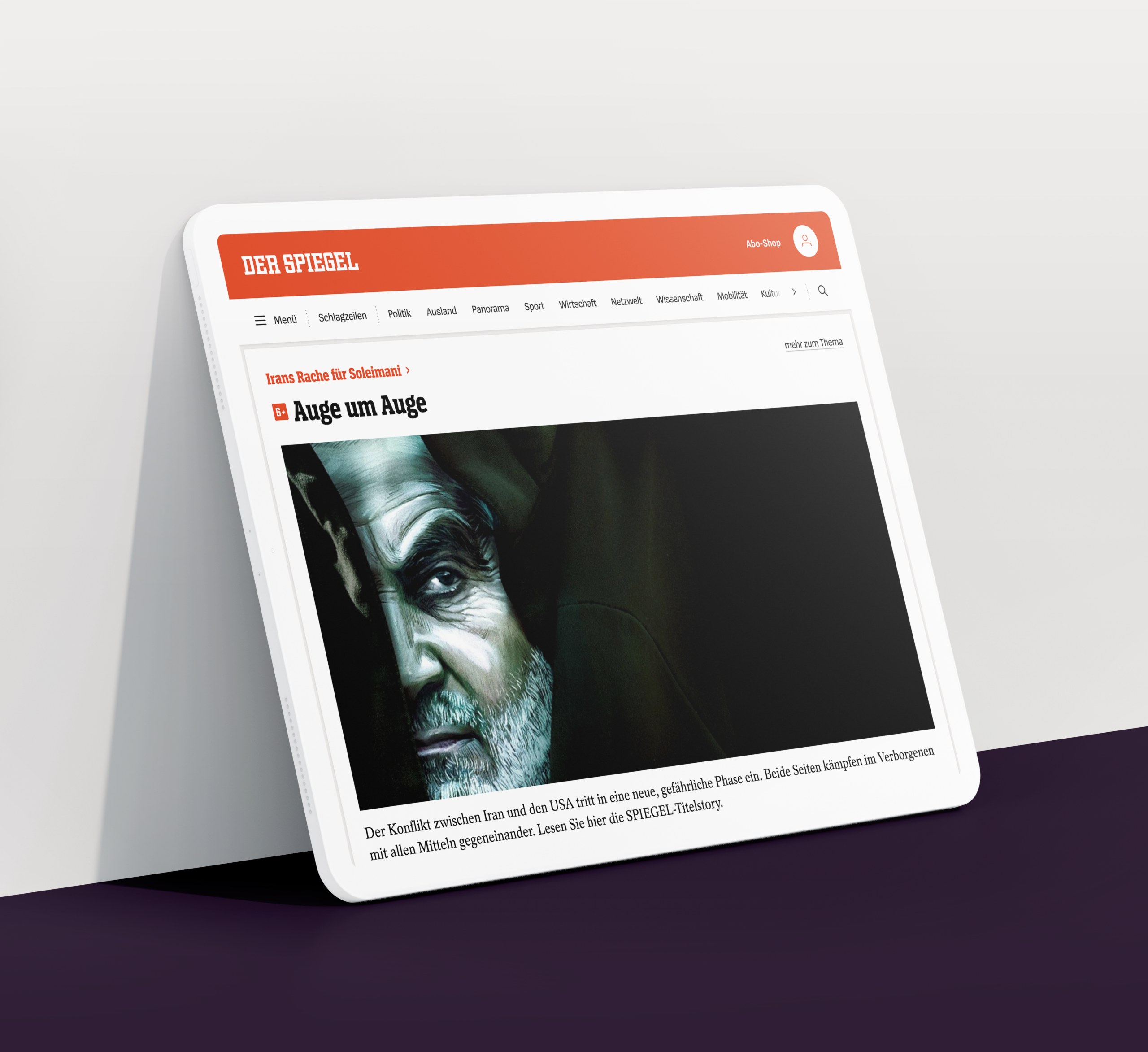
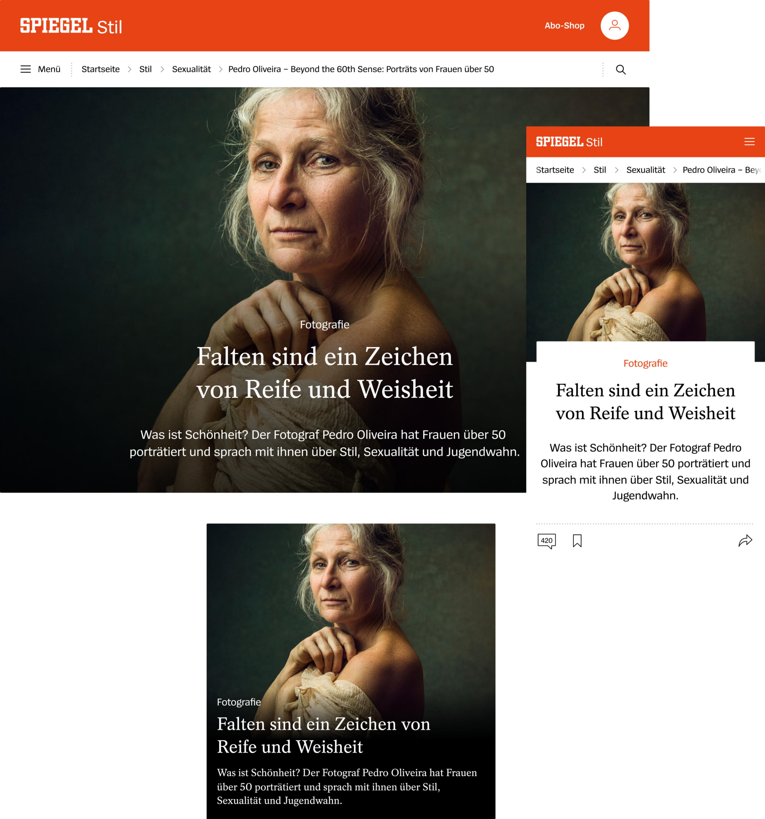
The reduced interface and the clear color scheme have a tidy effect and are deliberately restrained. However, the brand is always noticeable through the signal red and the concise typography, without imposing itself. This gives the images, headlines and stories the correct space they need.

- Client
- Der Spiegel
- Agency
- Make Studio
- Creative Direction
- Michael Ahlf
- Digital Design
- Finn Fischer
Dominic Scholtis
- Illustration
- Patrick Mariathasan